The Visma brand is uniquely positioned in the market through our local presence and commitment to creating technology that supports society. Our aim was to make this more visible in our communication.
We developed our new creative concept to reinforce our position as an innovative software and technology company. We looked at our entire brand platform, from our values to our tone and voice and visual design, in the process.
The concept focuses on storytelling, using local stories and real people in our communication to connect with our audiences. And the expression is more entrepreneurial, innovative and bold.
So how does this translate into our design?
Visma Unified Design
We want to stand out from the crowd. Our ambition is to support a strong master brand while helping Visma companies create strong product brands. And with Visma Unified Design, that is exactly what we do.

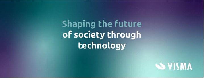
Visma is more than one colour. We have developed a colour universe that sets a more assertive tone, looks dynamic and makes it easier to differentiate our different products and product lines. We have created a concept that uses dynamic shapes that reflect how technology evolves. In a bold combination with strong use of colours.
Our campaigns
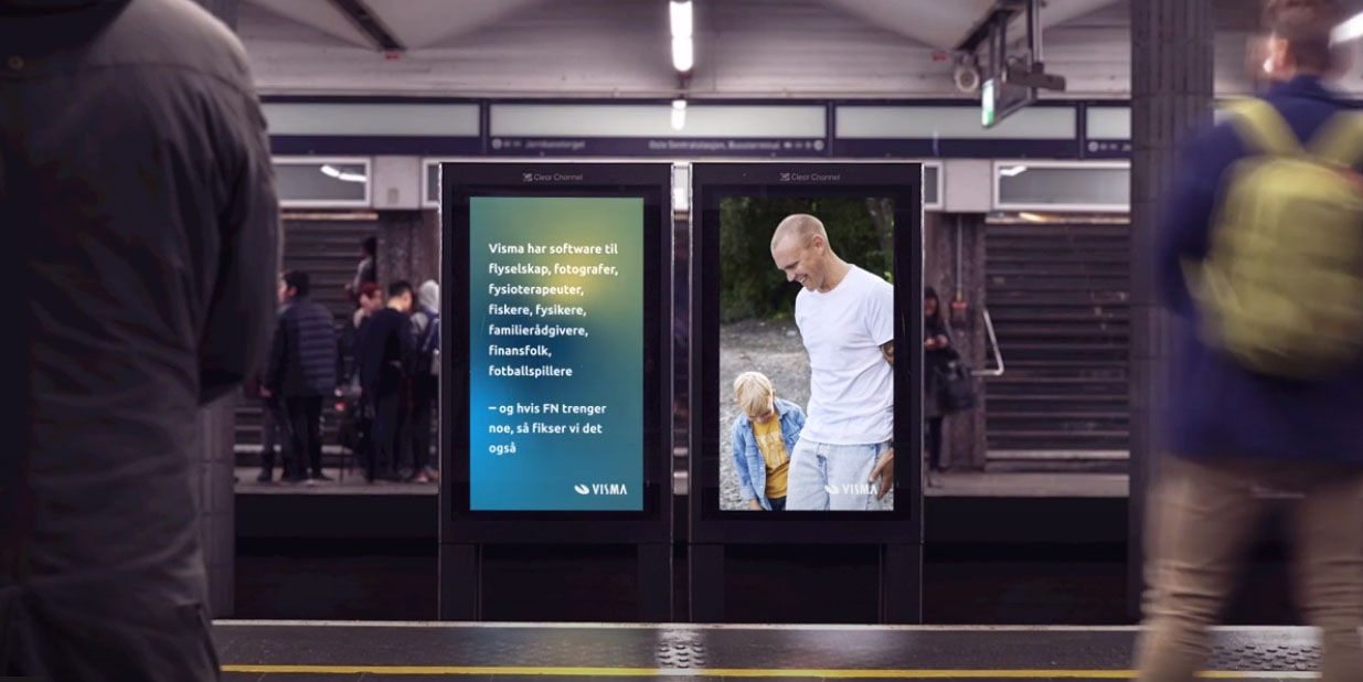
We launched several branding campaigns featuring our new creative concept during the year. Visma ads graced billboards across cities and were viewed by thousands of people online and on social media. The campaigns successfully created engagement among our employees and audiences in our core markets.

